By Lon Hosford
Mobile web browsers may scale down your web page. That can result in an unattractive and
unreadable content. They may show a partial width of your page.

This makes the user resize and horizontally scroll your page. Or worse they might just hit the back button. You may find that these default behaviors of mobile web browsers render the work that you put into designing your page ineffective. So let’s look at this problem and the simple HTML tag to correct it.
The Viewport
The viewport represents the boundaries of the part of the content you can see. 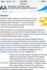 The content you cannot see you might say is “off screen”. It is actually masked by the boundaries of the viewport as on the right screen shot of the NOAA website.
The web browser window in a typical laptop and desktop is the viewport of your web pages. Of course laptops and desktop screens also present themselves as a viewport for running windows.
For most mobile devices the web browser does not have a window in the same respect does a web browser on a laptop or desktop. Often the web browser viewport is the actual width and height of the device. So unlike a desktop where you can position the web browser partially off screen, you cannot do that with a mobile web browser.
Mobile web browsers will make some assumptions about your web page if it does not already fit within the dimensions of the device viewport. This could be how much it scales and what percentage of the width it wants in the viewport width.
You can visit the web browser web sites to find out exactly how that works. But why bother unless you do not plan to design or redesign your web page to fit within the viewport. For a field trip you can visit the Safari Viewport Configuration Web Page.

The HTML meta Tag for Viewport
The HTML meta tag is used to override the mobile web browser’s default calculations for dimensions and scaling. The name attribute is set to viewport. The content attribute contains a number properties expressed as name value pair options separated by commas. The two properties you need are width and initial-scale.
The width property is set to device-width. The initial-scal property is set to 1.
Here is the completed meta tag line.
<meta name="viewport" content="width=device-width, initial-scale=1">
The width is in pixels. The initial-scale is actually a multiplier. Without setting other content properties, one means really no scaling.
The other content properties include height minimum-scale, maximum-scale and user-scalable.
[ad name=”Google Adsense”]
The minimum-scale, maximum-scale properties are the minimum and maximum viewport scales with a range. For Safari mobile web browser that range is 0-10.
The user-scalable property determines whether or not the user can zoom in and out to change the scale of the viewport. Values are yes and no.
Here is the meta tag in the head section of your HTML.
<!doctype html>
<html>
<head>
<meta charset="UTF-8">
<meta name="viewport" content="width=device-width, initial-scale=1">
<title>CSS Mobile Media Queries 101 | Lon Hosford</title>
Examples and Demo
If you are following along with the series, we are adding the meta tag for the viewport. This video reviews the problem, presents some examples of the problem, discusses the viewport meta tag properties and adds the single line to our practice file.
[iframe https://www.youtube.com/embed/5xFRFBW-jwQ 640 360]
Source Files for the video series: Download
[ad name=”Pearson Web Dev Books”]