You never know what experiences will lead you down a path. This one lead me to develop my first software product: the WP Stripe Kit Lite Wordpress plugin and I had no intention of ever writing one.
Bad Code and Bad Support Spells Trouble
I was working with a client recently who wanted to integrate the Stripe payment platform into their WordPress website. What they experienced was costly trouble.
Initially their requirement appeared to be a simple item product purchase like an eBook and a monthly subscription to their printed newsletter.
They already had selected a few plugins available at the Wordpress plugins website. For most plugins they had to purchase the “pro” version to get the features they wanted. Often this involved uninstalling and reinstalling.
Plugin after plugin they tried created either erratic results, you know working and then not working, or they broke their WordPress theme, a theme that had a high user satisfaction record in the marketplace.
After analyzing each plugin I found bad programming practices as the cause for the problems. In fact, some of the plugin support pages admitted possible conflicts with other plugins and themes. Image that!
And it gets worse, some plugin developers were nowhere to be found getting back on support questions and often blaming their own users. I even sent the them code fixes they needed to implement to make their plugin more stable.
The Truth Will Set You Free
Often a you need to report the truth to a client and risk ending the engagement need.
Unfortunately I had to report to the client all the plugins they tried would not work with their WordPress site, a site they already put lots of hours into setting up.
At that point the engagement changed from helping them fix broken software to finding a solution. As it turned out by listening to their needs a more robust ecommerce plugin was needed and then they found one, installed it and tested it. Even it had a problem, but fortunately the plugin developer fixed it and provided fast support.
A Better Mouse Trap?
As I was working on the engagement I learned how WordPress plugins were built. I thought I should create a plugin like all those that had problems but with better software programming practices.
It started out as a learning exercise and quickly grew into a product.
I got intoxicated with the plugin development process and ended up with the WP Stripe Kit Lite plugin. It is open source and free and available on the WordPress plugin site and at my website.
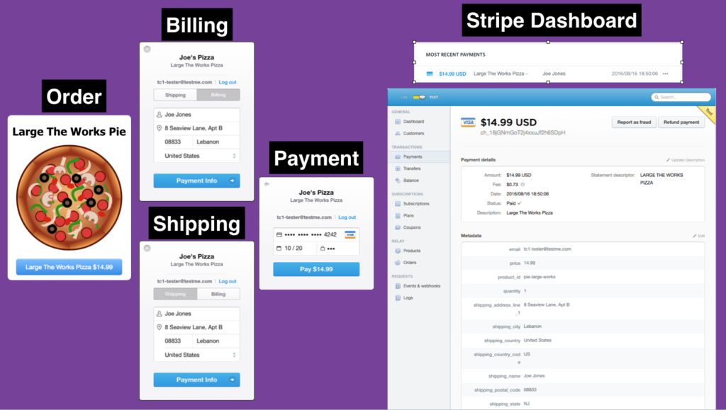
WP Stripe Kit Lite Order Flow with Shipping
This is my first effort at creating a software program that anyone could use. I was pretty nervous about the exposure and the whole process but managed to navigate through the tricky WordPress developer documentation to getting one approved and released.
I first went out to find the best practices for writing WordPress plugins and found plenty of information that apparently the plugins that failed my client were ignoring. I even improved on these best practices by adding one of my own called namespaces (programmers will understand what that means).
A Better Plugin World Perhaps
Hopefully WP Stripe Kit Lite will help those WordPress website owners who need to quickly integrate checkout buttons into their WordPress pages and posts for single item orders or recurring billing subscriptions.
Since it is open source, other plugin programmers may benefit from the best practices I put into place.
Where to go next?
Now I am hooked on developing for WordPress and begun looking at updating this plugin with more features ( I cut a lot out to get it released) and even started looking at building WordPress themes.
Time to put CSS responsive design into action with example that can serve as basic template. This is the last of five articles on Mobile First Responsive Design.Mobile First Responsive Design Layout and Flexible Image TutorialThe previous articles introduced using the link element to select external CSS files based on screen widths. The technique detects the minimum width breakpoint for a range of screen widths with the breakpoint being the smallest width.
This technique provides an opportunity to add CSS @media selectors into each of these external CSS files in a way that mimics CSS media query nesting. Nesting CSS media queries is introduced with CSS3, but reports as of this article is that they are not reliable across CSS3 compatible web browsers.
Additionally the use of the external CSS files for each screen width breakpoint helps organize and plan the climb from the smallest width to the largest width. As we move forward we can make adjustment for special needs. For example an intermediate width need can be handled with an @media selector in one of the minimum width CSS files. Or another example is the landscape orientation. This is what we do in this example.
[ad name=”Google Adsense”]
Here is the step by step video. You can follow along or audit. It will reveal the decision making process and show the progressive changes as the choices are applied. This way you can make visual comparisons.
[iframe https://www.youtube.com/embed/CRSxF7a95Go 640 360]
[ad name=”Pearson Web Dev Books”]
Source Files for the video series: Download
In this post the completed code is presented along with comments on the relevant items.
HTML Overview – practice.html File
These are the link elements for each separate CSS file.
base.css for basic styling of all the structure elements.
screen-min-320.css for smartphones widths through tablet widths.
screen-min-768.css for tablet widths through laptop desktop widths.
screen-min-1024.css for laptop desktop widths.
The media attribute’s contains the media query rule. And as you see the are ordered mobile first which means base and then the smallest screen to the largest screen width breakpoint.
<title>CSS Mobile Media Queries 101 | Lon Hosford</title>;
<!-- Base css -->;
<link rel="stylesheet" type="text/css"href="base.css" />;
<!-- True if greater than or equal to 320px -->
<link rel="stylesheet" type="text/css" media="only screen and (min-width: 320px)" href="screen-min-320.css" />;
<!-- True if greater than or equal to 768px -->;
<link rel="stylesheet" type="text/css" media="only screen and (min-width: 768px)" href="screen-min-768.css" />;
<!-- True if greater than or equal to 1024px -->;
<link rel="stylesheet" type="text/css" media="only screen and (min-width: 1024px)" href="screen-min-1024.css" />;
</head>;
The content is structured with one container div element on lines 17 to 47.
There are four inner containers.
One for the page header one lines 18 to 20 containing one level one heading element.
One on lines 21 to 28 for the page content using the div id’d as main. It contains a single article. The article has a level 2 header and paragraph elements.
The third on lines 28 to 42 holds feature content in the div element id’d as featured. The featured content contains three articles. Each of those have a level 3 header element and a paragraph element.
And the last container is lines 43 to 45 for the page footer.
Line 46 is a Creative Commons link for the glyph icons used from GLYPHICONS.
Complete practice.html File
<!doctype html>
<html>
<head>
<meta charset="UTF-8">
<meta name="viewpor" content="width=device-width, initial-scale=1">
<title>CSS Mobile Media Queries 101 | Lon Gosford</title>
<!-- Base css -->
<link rel="stylesheet" type="text/css" href="base.css" />
<!-- True if greater than or equal to 320px -->
<link rel="stylesheet" type="text/css" media="only screen and (min-width: 320px)" href="screen-min-320.css" />
<!-- True if greater than or equal to 768px -->
<link rel="stylesheet" type="text/css" media="only screen and (min-width: 768px)" href="screen-min-768.css" />
<!-- True if greater than or equal to 1024px -->
<link rel="stylesheet" type="text/css" media="only screen and (min-width: 1024px)" href="screen-min-1024.css" />
</head>
<body>
<div id="container">
	<header>
		<h1>Scriptum Titulus</h1>
	</header>
	<div id="main">
		<article>
			<h2>Pagina Titulus</h2>
			<p><img src="user_female_400x400.png" alt="User female icon"/>Sed consequat feugiat dictum. Aliquam fermentum sodales lectus in aliquam. Duis venenatis augue quis eros egestas fringilla. In consectetur eleifend hendrerit. Praesent quis interdum ligula. Nulla et aliquam lorem, ut ultricies elit. Nulla blandit nunc orci, ac ultricies nisi ultricies sit amet. Suspendisse nec metus est. Donec sem diam, cursus nec enim et, interdum tristique quam. Aliquam et dolor arcu.</p>
			<p>Donec vel libero enim. In porta at mauris a mattis. Sed rhoncus dolor ut purus feugiat lobortis. Proin vel tellus consequat, mattis diam eu, egestas lacus. Morbi dictum justo ac erat condimentum venenatis. ctoginta et septem annos in hoc continente novam nationem pepererunt patrum in libertate conceptam, et dedicatam ad propositum quod omnes homines pares creantur.  Nulla accumsan in erat sit amet placerat. Nunc augue dolor, aliquet id ligula in, rhoncus sollicitudin elit. Phasellus rhoncus laoreet elit, ac aliquet risus tincidunt eu. Suspendisse vitae ligula commodo, tristique justo consectetur, congue justo. In semper sed quam eget rutrum. </p>
			<p>Eros fusce ut in dolor diam, nec aenean, adipiscing et delectus nibh. Fermentum maecenas aliquam malesuada at dolor ullamcorper, eu mattis sed et sociosqu morbi, metus hymenaeos cras lacus tincidunt, potenti vestibulum pede malesuada rutrum lorem. </p>
		</article>
	</div>
	<div id="featured">
		<article>
			<h3>Sed eu dolor</h3>
			<p><img src="glyphicons_163_iphone_fff_stroke.png" width="24" height="24" alt="smart phone icon"/>Nulla accumsan in erat sit amet placerat. Maecenas ullamcorper id leo eu lacinia. In hac habitasse platea dictumst.</>;
		</article>
		<article>
			<h3>Sed rhoncus dolor</h3>
			<p><img src="glyphicons_025_binoculars_fff_stroke.png" width="24" height="24" alt="binoculars icon"/>Octoginta et septem annos in hoc continente novam nationem pepererunt patrum in libertate conceptam, et dedicatam ad propositum quod omnes homines pares creantur. Bellum civile et magnum quidem iam nos occupans tentat rem publicam illam, vel sic nata et dedicata, diu manere potest. Nam occurrit illud magnum bellum bello.</p>
		</article>
		<article>
			<h3>Phasellus rhoncus laoreet</h3>
			<p><img src="glyphicons_041_charts_fff_stroke.png" width="24" height="24" alt="bar chart icon"/>Bellum civile et magnum quidem iam nos occupans tentat rem publicam illam, vel sic nata et dedicata, diu manere potest. Proin vel tellus consequat, mattis diam eu, egestas lacus. Morbi dictum justo ac erat condimentum venenatis. Praesent quis interdum ligula. Nulla et aliquam lorem, ut ultricies elit.</p>
		</article>
	</div>
	<footer>
		<p>Vestibulum MMXIV&</p>
	</footer>
	<small><a href="http://glyphicons.com/" target="_blank">GLYPHICONS</a> CC BY / Filter Effects</small>
</div>
</body>
</html>
The box-sizing CSS Property in Responsive Design
The base.css file uses border-box for the box-sizing property and applies it using the universal selector.
base.css
* {
	/* Use border box for width computation GE IE8 */
	-webkit-box-sizing:border-box;
	-moz-box-sizing:border-box;
	box-sizing:border-box;
	color:#fff;
	margin:0;
	padding:0;
}
The box-sizing property is all about what parts of the box model is included in the width property.
The default value content-box applies the width property to the content and not to the padding or border-width properties. As a result your box actual width appears larger than the width property setting when there is padding or border values.
The border-box value simply includes the border-width and padding in the border-width properties.
This becomes very helpful with percentage widths for flexible layouts and for flexible images.
Flexible Images
Flexible images are easy. I like to apply it as the default image styling. Then make adjustments as needed.
The need for the flexible images is the in between widths. We are only targeting minimum width breakpoints. Not all smart phones for example are 320 pixels wide. So this handles all the device widths up to the next width break point. For that matter it handles all device widths until we have a need to deviate.
Then we do have a need for images to remain at their defined size. So with a good HTML structure you should be able to target them. Here we have the images that are in the featured articles of the document. If there are other image needs within this target then we will need to be more specific.
Simple return the width and height properties back to the default value of auto.
We also have these icons float to the left so they appear at the start of the paragraphs containing them.
Flexible images do not require 100% width. We can make adjustments for their width where it makes sense. Here we target the main article image to a 90% flexible width.
A Landscape Orientation Need Filled By The @media Selector
Keep in mind design drives the code. So we are simulating a design need for smartphone (320px – 1023px width) screens. That need is to have the main article image float to the right of the article text and have the text wrap it.
To solve that we added a CSS media query targeting landscape orientation in the screen-min-320.css file.
Because we used the link element to select this file, we have a simple CSS media query rule to write.
However is we did this say with one large CSS file we would have to have a compound media query rule that would include both the minimum width and orientation. Some like this only screen and (min-width: 320px) and (orientation:landscape).
You see you have alternatives and you just need to find the combination best suited to your needs. For beginners, separating out the target minimum widths using a mobile first design is my recommendation. Then use overrides like this to hone in on specific device detection needs.
Complete screen-min-320.css File
/* Smallest Screen Size Design Target */
/* Example: iPhone portrait */
/* True if width greater than or equal to 320px */
body {background:#FF0066;}
@media (orientation:landscape) {
	#main article img {
		float:right;
		display:inline;
		height:auto;
   		margin:0 1.1em .75em .75em;
		width:35%;
	}
}
The One Column to Two Column Responsive Crossover
The widths from 768 pixels on up called for a two column layout moving the featured articles to the right of the main article.
So that is done with floated containers and using widths as percents. Since the box-sizing property is set to border-box we are more confident that the percentage widths will work and we will not have the push down problem where one floated container does not fit.
One Last @media Selector For Laptops and Desktop Widths
Once we hit the 1024 pixel width we are assuming a laptop or a desktop screen. In these case the operating systems have windows for displaying applications. The windows are resizable. The web browser is an application. So as the screens get wider, the user can max up the width to the point our design layout breaks apart like expanding outer space.
The usual solution to that is a maximum width.
Also we are going to have some viewport margins for these widths. That is outside the container div element.
The design calls for background image but not until we get to 1200 pixels wide. That may be that the viewing space for the image is not aesthetic until we get width. But it is a design choice. So we have another CSS media query to handle showing the background image at the chosen width which here is 1200 pixels.
Complete screen-min-1024.css File
/* Examples: iPad landscape, Laptops and Desktops */
/* True if width greater than or equal to 1024px */
body {background:#33CC33;}
#container {
	background-color:inherit;
	margin: 0 auto;
	max-width:1200px;
}
@media only screen and (min-width: 1200px) {
	body {background-image:url(weave_green_bg_100x100.png);}
}
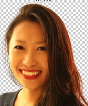
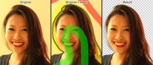
Example using Woman's Face Background Removed. Source: https://clippingmagic.com
By Lon Hosford
I really hate using powerful graphic programs to do simple tasks in artwork workflow. One specific workflow task is removing backgrounds from images.Example using Woman’s Face. Source: https://clippingmagic.com Often these are hurried photos taken wrenching the smartphone from its case or purse and snapping a shot. It is also the typical case purchased artwork or even free artwork.
You need to bring up that nasty Photoshop or Fireworks, bogging down your computer resources, requiring an original bloated file, dealing with layers, tolerances, masks, fettering, anti-aliasing and many trial and error steps to just remove artwork backgrounds. In most cases the original is the artwork without the background. And that is what I want to move along to the next task in artwork development.
I crossed a SAS (Software as a Service) website Clipping Magic. It is free first to note. Second there is no signup needed. It has one targeted goal. That is to “Instantly Remove The Background From Your Images”.
[ad name=”Google Adsense”]
Just Three Minus One Steps
There are three steps, well actually two steps.
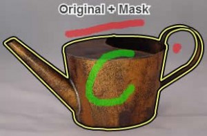
1. “Drag your image onto the drop-zone above, or choose a file using the button.” Yes literally when their website loads you drag your image into the target drop zone. No signup or hassles. Example Watering Pot Original. Source: https://clippingmagic.com
2. “Mark some foreground green and some background red and the algorithm takes care of the details.” The spacebar worked in Safari for me to toggle red and green. Example Watering Pot Original. Source: https://clippingmagic.com
[ad name=”Pearson Web Dev Books”]
3. “The background is removed by adding an alpha channel, with a suitably feathered boundary.” In addition to the default transparent background you can choose a solid background from a pallet, a color chooser or enter a color hex value.
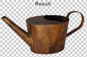
Other features in the tool include zooming, adjusting the sensitivity of the tool. You download and it will suffix the file name with clipped_rev_1.png, upping the digit for each revision.
By Lon Hosford
You have a plethora of configuration approaches with using CSS Media Queries in creating a mobile first design. The previous tutorials we places all the CSS into the HTML document. That was fine for a learning activity. You know that we need to use external CSS files. That means using the HTML link element in the document head section.
The @media CSS selector is just plain CSS so we can use it in an external CSS file. So all the CSS we had in the document style element can be put into a CSS file and it works the same.
Our CSS length was short and tailor for quick absorption in a learning activity. You can count on the CSS lines growing quickly as you start to include your design styling not only for one layout but possibly for multiple screen layouts. The CSS file can get pretty long. So you can consider an approach to break the CSS into separate files for each minimum screen width. Then you can just put the media query CSS in each file. This approach also works.
[ad name=”Google Adsense”]
Then consider that the link element has the media attribute that uses the same media query syntax as the @media CSS selector. That allows you attach a CSS file only when the media query is true. It also negates the need for the media selector in the file. Essentially you are saying all the CSS in a file is for a specific group of screen widths starting at a certain minimum and expanding until another media query takes over any selectors and properties.
In this post we are taking the last example and breaking it up this way. One file for the base css and one file for each target minimum screen width.
Configuration Approaches and Refactoring Demonstration
This video covers the CSS Mobile First Responsive Design Configuration Approaches. It also demonstrates the refactoring of the last tutorial’s files into external files for the base and each target minimum screen width.
[iframe https://www.youtube.com/embed/4OUWvKYpLw8 640 360]
[ad name=”Pearson Web Dev Books”]
Source Files for the video series: Download
The link Element media Attribute
These are the link elements for each separate CSS file we plan to use.
base.css
screen-min-320.css
screen-min-768.css
screen-min-1024.css
The @media selector media query syntax is becomes the media attribute’s value. Then you order the files starting with the base followed by the CSS file for the smallest design width. The you progressively add the CSS files for each next minimum width target.
<title>CSS Mobile Media Queries 101 | Lon Hosford</title>
<!-- Base css -->
<link rel="stylesheet" type="text/css"href="base.css" />
<!-- True if greater than or equal to 320px -->
<link rel="stylesheet" type="text/css" media="only screen and (min-width: 320px)" href="screen-min-320.css" />
<!-- True if greater than or equal to 768px -->
<link rel="stylesheet" type="text/css" media="only screen and (min-width: 768px)" href="screen-min-768.css" />
<!-- True if greater than or equal to 1024px -->
<link rel="stylesheet" type="text/css" media="only screen and (min-width: 1024px)" href="screen-min-1024.css" />
</head>
Each of the CSS files could contain the @media selector. If that was the case, then you do not need the link element media attribute.
A drawback is that we have increased number of network HTTP requests. Bandwidth performance is impacted by many items. Files do lend themselves to caching. So you need to perform your own bandwidth analysis to see if using multiple CSS files has any significant impact on your performance.
A happy medium might be one CSS file for the base and one for handling screen width detection.
base.css
screen.css
In that case you would include the @media selectors in the screen.css file.
Complete practice.html File
<!doctype html>
<html>
<head>
<meta charset="UTF-8">
<meta name="viewport" content="width=device-width, initial-scale=1">
<title>CSS Mobile Media Queries 101 | Lon Hosford</title>
<!-- Base css -->
<link rel="stylesheet" type="text/css"href="base.css" />
<!-- True if greater than or equal to 320px -->
<link rel="stylesheet" type="text/css" media="only screen and (min-width: 320px)" href="screen-min-320.css" />
<!-- True if greater than or equal to 768px -->
<link rel="stylesheet" type="text/css" media="only screen and (min-width: 768px)" href="screen-min-768.css" />
<!-- True if greater than or equal to 1024px -->
<link rel="stylesheet" type="text/css" media="only screen and (min-width: 1024px)" href="screen-min-1024.css" />
</head>
<body>
	<header>
		<h1>Scriptum Titulus</h1>
	</header>
	<section>
		<h2>Pagina Titulus</h2>
		<p>Sed consequat feugiat dictum. Aliquam fermentum sodales lectus in aliquam. Duis venenatis augue quis eros egestas fringilla. In consectetur eleifend hendrerit. Praesent quis interdum ligula. Nulla et aliquam lorem, ut ultricies elit. Nulla blandit nunc orci, ac ultricies nisi ultricies sit amet. Suspendisse nec metus est. Donec sem diam, cursus nec enim et, interdum tristique quam. Aliquam et dolor arcu.</p>
		<p>Donec vel libero enim. In porta at mauris a mattis. Sed rhoncus dolor ut purus feugiat lobortis. Proin vel tellus consequat, mattis diam eu, egestas lacus. Morbi dictum justo ac erat condimentum venenatis. Nunc augue dolor, aliquet id ligula in, rhoncus sollicitudin elit. Phasellus rhoncus laoreet elit, ac aliquet risus tincidunt eu. Suspendisse vitae ligula commodo, tristique justo consectetur, congue justo. In semper sed quam eget rutrum.</p>
	</section>
</body>
</html>
By Lon Hosford
Media queries have a somewhat confusing syntax. This is typical as web page technologies evolve. Often there is a lot of forward thinking and features are added that may never become mainstream. So we need to sort out the parts of the syntax that are important to mobile first responsive design.
Media queries can be added and using the CSS @media selector. The @media selector’s basic job is to create a test inside the CSS code. One of the tests is for the type of media.
Media Types
There is a keyword list for the media types web browsers may detect using media queries. The list includes all, aural, braille, embossed, handheld, print, projection, screen, speech, tty, andtv. Descriptions of these appear at the end of this article. We will use the screen type for mobile detection.
Media Type Properties (Features)
Then each media type has a potential of feature properties. We are not going to explore all of them other to mention the list which is color, color-index, aspect-ratio, device-aspect-ratio, device-height, device-width, grid, height, monochrome, orientation, resolution, scan, and width. Descriptions of each appear at the end of this article. Keep in mind they do not all apply to every media type and may apply to more than one media type. Also the feature properties may allow a min- or max- prefix. For example min-device-width or max-height.
[ad name=”Google Adsense”]
For our purposes we are only interested in the width property. For our mobile first approach we will prefix as min-width.
Mobile First Responsive Design Step By Step
This video covers the media type and properties and applies them to the practice file.
[iframe https://www.youtube.com/embed/Yhtyp20CBlg 640 360]
Source Files for the video series: Download
Complete Starting Practice File
<!doctype html>
<html>
<head>
<meta charset="UTF-8">
<meta name="viewport" content="width=device-width, initial-scale=1">
<title>CSS Mobile Media Queries 101 | Lon Hosford</title>
<style type="text/css">
	header, section{ display: block; }
	/* All elements */
	* {
		color:#FFF;
		margin:0;
		padding:0;
	}
	body {
		background:#575757;
		font-family:Helvetica, Arial, sans-serif;
	}
	header h1 {
		background:rgba(0,0,0,.7);
		font-size:.8em;
		height: 3em;
		line-height:3em;
		padding:0 .5em;
	}
	section {
		margin:0 0 1em 0;
		padding:.6em;
	}
	section h2{
		font-size:.7em;
		padding-bottom:1em;
	}
	section p{
		font-size:.6em;
		padding-bottom:1em;
	}
</style>
</head>
<body>
	<header>
		<h1>Scriptum Titulus</h1>
	</header>
	<section>
		<h2>Pagina Titulus</h2>
		<p>Sed consequat feugiat dictum. Aliquam fermentum sodales lectus in aliquam. Duis venenatis augue quis eros egestas fringilla. In consectetur eleifend hendrerit. Praesent quis interdum ligula. Nulla et aliquam lorem, ut ultricies elit. Nulla blandit nunc orci, ac ultricies nisi ultricies sit amet. Suspendisse nec metus est. Donec sem diam, cursus nec enim et, interdum tristique quam. Aliquam et dolor arcu.</p>
		<p>Donec vel libero enim. In porta at mauris a mattis. Sed rhoncus dolor ut purus feugiat lobortis. Proin vel tellus consequat, mattis diam eu, egestas lacus. Morbi dictum justo ac erat condimentum venenatis. Nunc augue dolor, aliquet id ligula in, rhoncus sollicitudin elit. Phasellus rhoncus laoreet elit, ac aliquet risus tincidunt eu. Suspendisse vitae ligula commodo, tristique justo consectetur, congue justo. In semper sed quam eget rutrum.</p>
	</section>
</body>
</html>
You see we already have the meta tag on line 5 that directs mobile web browsers to not resize the web page and fit it all within the device width.
Then we have a base set of styles and selectors. These are minimal and you can expand on them for your own work. These styles appear as the default for all device widths. Also we want to design a single column view for the base. Fortunately that is the default for web browsers.
The first query is for a 320 pixel width. As the comments show, this is the first width for devices like an iPhone. At this point it also will represent all widths over 320 pixels. Also we can refer to this as a break point.
We just are changing the background color for the body selector. Something simple like the body background color is a quick way to verify your media queries are working.
	/* Smallest Screen Size Design Target */
	/* Example: iPhone portrait */
	/* True if width greater than or equal to 320px */
	@media only screen and (min-width: 320px) {
		body {background:#B26BB2;}
	}
Next we add two more break points for 768 and 1024 pixels. In those we override the body selector background-color property.
	/* Example: iPad portrait */
	/* True if width greater than or equal to 768px */
	@media only screen and (min-width: 768px) {
		body {background:#33CCCC;}
	}
	/* Examples: iPad landscape, Laptops and Desktops */
	/* True if width greater than or equal to 1024px */
	@media only screen and (min-width: 1024px) {
		body {background:#FF0066;}
	}
This is the practice.html file completed to this point. You can open in your favorite browser.
<!doctype html>
<html>
<head>
<meta charset="UTF-8">
<meta name="viewport" content="width=device-width, initial-scale=1">
<title>CSS Mobile Media Queries 101 | Lon Hosford</title>
<style type="text/css">
	header, section{ display: block; }
	/* All elements */
	* {
		color:#FFF;
		margin:0;
		padding:0;
	}
	body {
		background:#575757;
		font-family:Helvetica, Arial, sans-serif;
	}
	header h1 {
		background:rgba(0,0,0,.7);
		font-size:.8em;
		height: 3em;
		line-height:3em;
		padding:0 .5em;
	}
	section {
		margin:0 0 1em 0;
		padding:.6em;
	}
	section h2{
		font-size:.7em;
		padding-bottom:1em;
	}
	section p{
		font-size:.6em;
		padding-bottom:1em;
	}
	/* Smallest Screen Size Design Target */
	/* Example: iPhone portrait */
	/* True if width greater than or equal to 320px */
	@media only screen and (min-width: 320px) {
		body {background:#B26BB2;}
	}
	/* Example: iPad portrait */
	/* True if width greater than or equal to 768px */
	@media only screen and (min-width: 768px) {
		body {background:#33CCCC;}
	}
	/* Examples: iPad landscape, Laptops and Desktops */
	/* True if width greater than or equal to 1024px */
	@media only screen and (min-width: 1024px) {
		body {background:#FF0066;}
	}
</style>
</head>
<body>
	<header>
		<h1>Scriptum Titulus</h1>
	</header>
	<section>
		<h2>Pagina Titulus</h2>
		<p>Sed consequat feugiat dictum. Aliquam fermentum sodales lectus in aliquam. Duis venenatis augue quis eros egestas fringilla. In consectetur eleifend hendrerit. Praesent quis interdum ligula. Nulla et aliquam lorem, ut ultricies elit. Nulla blandit nunc orci, ac ultricies nisi ultricies sit amet. Suspendisse nec metus est. Donec sem diam, cursus nec enim et, interdum tristique quam. Aliquam et dolor arcu.</p>
		<p>Donec vel libero enim. In porta at mauris a mattis. Sed rhoncus dolor ut purus feugiat lobortis. Proin vel tellus consequat, mattis diam eu, egestas lacus. Morbi dictum justo ac erat condimentum venenatis. Nunc augue dolor, aliquet id ligula in, rhoncus sollicitudin elit. Phasellus rhoncus laoreet elit, ac aliquet risus tincidunt eu. Suspendisse vitae ligula commodo, tristique justo consectetur, congue justo. In semper sed quam eget rutrum.</p>
	</section>
</body>
</html>
If that browser has a responsive design viewer like Firefox, then try the different breakpoints. Otherwise you can resize the width of the web browser for an approximation.
As you do, try widths between the breakpoints and you can see the web browser default flexible rendering of block tags has the text wrap and unwrap as you adjust sizes. Notice that the background color remains the same within the breakpoints.
Understanding Responsive Design Changes
Changing the background color at breakpoints is interesting but is not the most probably design change you want to achieve for various breakpoints. You will want to change styling such as sizes of fonts , margins, padding and line-heights for example. Smaller fonts for narrow widths and larger fonts for wider widths. Less padding and margins for smaller widths and take advantage of the screen real estate of larger widths with more padding and margins.
You also may want different layouts. Narrow widths are likely to render a better experience for users if you design a single column layout. Then for the wider widths, you can introduce multiple column layouts.
For this article are just going to demonstrate some basic style changes to font sizes, font-color, padding and line-heights. In a future article we will experiment with a basic layout change.
Here are the changes:
	/* Smallest Screen Size Design Target */
	/* Example: iPhone portrait */
	/* True if width greater than or equal to 320px */
	@media only screen and (min-width: 320px) {
		body {background:#B26BB2;}
		header h1 {
			font-size:1.6em;
			height:2.8em;
			line-height:2.8em;
		}
		section {
			padding:.9em;
		}
		section h2{
			color:#000;
			font-size:1em;
		}
		section p{
			color:#000;
			font-size:.9em;
		}
	}
	/* Example: iPad portrait */
	/* True if width greater than or equal to 768px */
	@media only screen and (min-width: 768px) {
		body {background:#33CCCC;}
		header h1 {
			font-size:1.8em;
			height:3em;
			line-height:3em;
		}
		section h2{
			font-size:1.5em;
		}
		section p{
			font-size:1.3em;
		}
	}
	/* Examples: iPad landscape, Laptops and Desktops */
	/* True if width greater than or equal to 1024px */
	@media only screen and (min-width: 1024px) {
		body {background:#FF0066;}
		header h1 {
			font-size:2em;
			height:3.2em;
			line-height:3.2em;
		}
		section {
			max-width:1200px;
			padding:.9em;
		}
	}
You might want to turn your attention to the 1024 pixel breakpoint. There we are capping the width of the section selector. The idea is to keep the text from unwrapping for very large monitors. Some assumptions about content are going to go into such a choice. In our case it is arbitrary for demonstration.
But you will need to think about the base view and the largest break point extremes. The base view is for devices you have not considered below the first breakpoint. The design can be what every you want to put time and energy into creating or you may just want a near print ready styling. The widest breakpoint needs to handle the extreme widths.
Here is the completed practice file.
<!doctype html>
<html>
<head>
<meta charset="UTF-8">
<meta name="viewport" content="width=device-width, initial-scale=1">
<title>CSS Mobile Media Queries 101 | Lon Hosford</title>
<style type="text/css">
	header, section{ display: block; }
	/* All elements */
	* {
		color:#FFF;
		margin:0;
		padding:0;
	}
	body {
		background:#575757;
		font-family:Helvetica, Arial, sans-serif;
	}
	header h1 {
		background:rgba(0,0,0,.7);
		font-size:.8em;
		height: 3em;
		line-height:3em;
		padding:0 .5em;
	}
	section {
		margin:0 0 1em 0;
		padding:.6em;
	}
	section h2{
		font-size:.7em;
		padding-bottom:1em;
	}
	section p{
		font-size:.6em;
		padding-bottom:1em;
	}
	/* Smallest Screen Size Design Target */
	/* Example: iPhone portrait */
	/* True if width greater than or equal to 320px */
	@media only screen and (min-width: 320px) {
		body {background:#B26BB2;}
		header h1 {
			font-size:1.6em;
			height:2.8em;
			line-height:2.8em;
		}
		section {
			padding:.9em;
		}
		section h2{
			color:#000;
			font-size:1em;
		}
		section p{
			color:#000;
			font-size:.9em;
		}
	}
	/* Example: iPad portrait */
	/* True if width greater than or equal to 768px */
	@media only screen and (min-width: 768px) {
		body {background:#33CCCC;}
		header h1 {
			font-size:1.8em;
			height:3em;
			line-height:3em;
		}
		section h2{
			font-size:1.5em;
		}
		section p{
			font-size:1.3em;
		}
	}
	/* Examples: iPad landscape, Laptops and Desktops */
	/* True if width greater than or equal to 1024px */
	@media only screen and (min-width: 1024px) {
		body {background:#FF0066;}
		header h1 {
			font-size:2em;
			height:3.2em;
			line-height:3.2em;
		}
		section {
			max-width:1200px;
			padding:.9em;
		}
	}
</style>
</head>
<body>
	<header>
		<h1>Scriptum Titulus</h1>
	</header>
	<section>
		<h2>Pagina Titulus</h2>
		<p>Sed consequat feugiat dictum. Aliquam fermentum sodales lectus in aliquam. Duis venenatis augue quis eros egestas fringilla. In consectetur eleifend hendrerit. Praesent quis interdum ligula. Nulla et aliquam lorem, ut ultricies elit. Nulla blandit nunc orci, ac ultricies nisi ultricies sit amet. Suspendisse nec metus est. Donec sem diam, cursus nec enim et, interdum tristique quam. Aliquam et dolor arcu.</p>
		<p>Donec vel libero enim. In porta at mauris a mattis. Sed rhoncus dolor ut purus feugiat lobortis. Proin vel tellus consequat, mattis diam eu, egestas lacus. Morbi dictum justo ac erat condimentum venenatis. Nunc augue dolor, aliquet id ligula in, rhoncus sollicitudin elit. Phasellus rhoncus laoreet elit, ac aliquet risus tincidunt eu. Suspendisse vitae ligula commodo, tristique justo consectetur, congue justo. In semper sed quam eget rutrum.</p>
	</section>
</body>
</html>
[ad name=”Google Adsense”]
Media Types Reference
all
Simple for all devices.
aural
CSS2 version of speech
braille
Tactile braille devices.
embossed
Intended for paged braille printers.
handheld
Early choice for detecting small screen devices with low bandwidth capability.
print
For printing.
projection
Devices that facilitate projection of presentation. The typical projector is and example.
screen
Color computer screens.
speech
Devices that can synthesize speech. Compare to aural in CSS2.
tty
Fixed character width grid devices like teletypes and terminals. Devices usually have limited display features.
tv
Television like devices.
Media Types Features Reference
color1
Number of bits per color.
color-index1
Number of entries in the color look-up table.
aspect-ratio1
The display area ratio of the horizontal pixels to vertical pixels. Expressed as two unsigned integers separated by a slash.
device-aspect-ratio1
The output device area ratio of the horizontal pixels to vertical pixels. Expressed as two unsigned integers separated by a slash
device-height1
The output device height.
device-width1
The output device width.
grid
True if a grid device or a bitmap device is detected. For example a phone or teletype.
monochrome1
Detects the number of bits per pixel on a monochrome device.
height1
The rendering area height.
orientation
Tests for the values landscape or portrait.
resolution1
Pixel density of the device expressed as dots per inch (dpi) or dots per centimeter (dpcm).
By Lon Hosford
Mobile web browsers may scale down your web page. That can result in an unattractive and
unreadable content. They may show a partial width of your page.
This makes the user resize and horizontally scroll your page. Or worse they might just hit the back button. You may find that these default behaviors of mobile web browsers render the work that you put into designing your page ineffective. So let’s look at this problem and the simple HTML tag to correct it.
The Viewport
The viewport represents the boundaries of the part of the content you can see. The content you cannot see you might say is “off screen”. It is actually masked by the boundaries of the viewport as on the right screen shot of the NOAA website.
The web browser window in a typical laptop and desktop is the viewport of your web pages. Of course laptops and desktop screens also present themselves as a viewport for running windows.
For most mobile devices the web browser does not have a window in the same respect does a web browser on a laptop or desktop. Often the web browser viewport is the actual width and height of the device. So unlike a desktop where you can position the web browser partially off screen, you cannot do that with a mobile web browser.
Mobile web browsers will make some assumptions about your web page if it does not already fit within the dimensions of the device viewport. This could be how much it scales and what percentage of the width it wants in the viewport width.
You can visit the web browser web sites to find out exactly how that works. But why bother unless you do not plan to design or redesign your web page to fit within the viewport. For a field trip you can visit the Safari Viewport Configuration Web Page.
The HTML meta Tag for Viewport
The HTML meta tag is used to override the mobile web browser’s default calculations for dimensions and scaling. The name attribute is set to viewport. The content attribute contains a number properties expressed as name value pair options separated by commas. The two properties you need are width and initial-scale.
The width property is set to device-width. The initial-scal property is set to 1.
The width is in pixels. The initial-scale is actually a multiplier. Without setting other content properties, one means really no scaling.
The other content properties include height minimum-scale, maximum-scale and user-scalable.
[ad name=”Google Adsense”]
The minimum-scale, maximum-scale properties are the minimum and maximum viewport scales with a range. For Safari mobile web browser that range is 0-10.
The user-scalable property determines whether or not the user can zoom in and out to change the scale of the viewport. Values are yes and no.
Here is the meta tag in the head section of your HTML.
<!doctype html>
<html>
<head>
<meta charset="UTF-8">
<meta name="viewport" content="width=device-width, initial-scale=1">
<title>CSS Mobile Media Queries 101 | Lon Hosford</title>
Examples and Demo
If you are following along with the series, we are adding the meta tag for the viewport. This video reviews the problem, presents some examples of the problem, discusses the viewport meta tag properties and adds the single line to our practice file.
By Lon Hosford
Designing for mobile first is very easy if you have a single column of text and add the CSS img {height: auto; width: 100%; } to make the images flexible. But ultimately you design multiple column layouts and graphics that may not be suitable for dynamic resizing across the wide width spectrum of viewing screens that your visitor may be using. In particular for smaller devices you really do not want to exceed the device width. More importantly you do not want the device web browser scaling your fine layout and design into something hard to appreciate and even to read.
Responsive Web Page Design
To handle different viewing widths and device web browser defaults you are introduced to responsive web design.
Responsive design can be a very confusing subject with various approaches, techniques and even interpretations as to what it means. One dimension is designing different experiences for different target viewing devices but achieving the same content and action goals of the web page visit. Wow that is a lot when you figure the hundreds of viewing devices around. The other dimension is the implementation on the technical plain in HTML and CSS and is the main focus of these articles.
Mobile First Responsive Design Demo
[iframe https://www.youtube.com/embed/8CFfFDxMSR0 640 360]
On the technical side there are many approaches using HTML and CSS. A lot depends on design and what you can capitalize based on the features of the target devices such as aspect ratio, resolution, color, width and height to name a few. That is a lot of variables to design around when you consider the number of devices, their differences and even a simple feature of screen orientation. So you need to know when anyone of those has merit for detection and thus a design change to take advantage. For example a higher resolution might offer showing a better quality video or image.
So you need to filter and have a base point. With that in mind, one feature that transcends across all of these choices is device viewport widths. Designing for device viewport widths makes a great base point for simplicity of design and of implementation.
Designing for the Smallest Targeted Viewport Width
This series of articles presents one approach that focuses on planning for device widths and designing for the smallest width first. We can call this the mobile first approach. But it really designing for the smallest targeted viewport width. I will explore the viewport in one article, but the viewport is basically what you see if you position a window on your computer partially offscreen. You could say the smallest viewport width is one pixel, but really it is more what you want to put your time and effort into designing. Rather you need to be more selective about the target design viewport widths.
Dealing with the Endpoint Viewport Widths
You are going to have to think about the viewport width below your smallest target and the viewport width above the largest. Generally for the smallest viewport width you have a single column flexible layout using the smallest fonts that present text in a reasonable manner and images that are resized. I like to call that the base. I should be able to see the base from a small width to the largest width monitor resolution I can find. At the extremes it may not be very aesthetic, but it does allow content consumption.
For the largest target viewport width you are going to cap the content width.
Finally you are going to have two or three or more if you want to work harder, target viewport widths to make a design. In between those targets, your design is likely to be flexible. The target viewport widths are also called breakpoints.
[ad name=”Google Adsense”]
For example you may have the first viewport width set at 320 pixels, the second at 768 pixels, the third at 1024 pixels. You design for each needs to be flexible up to the next breakpoint. That handles the variety of devices between the breakpoints. The final breakpoint will work the same but it has a limit. The first breakpoint you could also specify a minimum scaling limit, but I would recommend you target the smallest width to simplify your work.
This series assumes you are new to responsible design using CSS but have a general experience with CSS that you can recognize it and query the Internet for additional learning as you need it. If not here are some resources that I have found helpful:
[ad name=”Pearson Web Dev Books”]
Project File Review
We will use a paired down HTML and CSS file for this series. This video reviews what is already set up.
Blog post icon for Creating a Simple Debugging Library
By Lon Hosford
I like to have a plan for debugging from the start. That usually means a debugging library. Debugging libraries can be simple and can be complex. Blog post icon for Creating a Simple Debugging LibraryThey can be procedural and they can be object oriented. No matter which approach, having something that is generic to your applications you can drop in is the minimum before coding. In particular a debugging library is handy when you inherit another PHP project where there is no breadcrumb on how testing and debugging was handled.
This is an example of a minimalist framework for a debugging library and testing dashboard. It is great for those first learning to program in PHP. I like to use it for teaching PHP.
There is a lot we can add to the library such as routing log messages to the UI or to a log file of your choice. But you can build these features onto this library by adding constants, functions and if needed global space variables.
<?php
/**
 *	Debugging configuration.
 *
 *	Search all source files for **PRODUCTION SETTING** for production settings
 *  @author Lon Hosford
 *  @link www.lonhosford.com
 *	@copyright 2014 Alonzo Hosford
 *  @license GPL
*/
/**
 *	Send runtime errors to stdout(1) vs stderr (0)
 *	**PRODUCTION SETTING** = 0
 */
ini_set('display_errors', 1);
/**
 *	Send startup errors to stdout(1) vs stderr (0)
 *	**PRODUCTION SETTING** = 0
 */
ini_set('display_startup_errors', 1);
/**
 *	PHP levels of error reporting
 *   0 = off
 *   E_ERROR | E_WARNING | E_PARSE = simple running errors
 *   E_ERROR | E_WARNING | E_PARSE | E_NOTICE = E_NOTICE adds uninitialized variables or catch variable name misspellings
 *   -1 or E_ALL = all errors
 *	**PRODUCTION SETTING** = 0
 */
error_reporting(E_ALL);
?>
The first important item to notice is the use of the search tag, **PRODUCTION SETTING**. It is important for documenting code changes necessary for moving code to other environments such as staging, pre-production and production.
* **PRODUCTION SETTING** = 0
You use a file search for **PRODUCTION SETTING** and examine the documentation for changing code to necessary values. If you have something different from production you can create other ways such as a separate search tag for each environment or a generic search tag that will document each environment.
Line 15 allows the override to the PHP configuration property display_errors for displaying errors with the PHP output.
ini_set('display_errors', 1);
The PHP ini_set function sets PHP runtime configuration values and takes the name of the configuration property as the first parameter and the value as the second parameter.
In this case any error messages from PHP are included in the output from PHP. This is regardless of the output format. So if it is a web page, the errors are mixed into the page. You may or may not see them as they could be stuck in the page header section. And this also means if the output is JSON, XML, NVP or any format, the errors ride along often spoiling the parser receiving the output.
Line 20 includes any errors that are generated from PHP starting. This is less common on a well tested hosting site running PHP. But I included just in case as if the error is not in your code it may show here.
ini_set('display_startup_errors', 1);
The final item is to filter the category levels of PHP errors. The usual choices are 0 for off and the constant E_ALL for all levels.
error_reporting(E_ALL);
You can include bitwise operations to combine the other constants listed in the comments. You may find that helpful when inheriting code with many errors to filter out key errors to flesh out, third party code or you have created an error that cascaded a multitude of errors. Avoid that latter situation with test often and in small code units.
Application Common Library – lib_common.inc.php
<?php
/**
 *	Library for common database configuration, data and initalizations.
 *
 *	Include before running other scripts.
 *	Search all files for **PRODUCTION SETTING** for production settings
 *	@author Lon Hosford
 *  @link www.lonhosford.com
 *	@copyright 2014 Alonzo Hosford
 *  @license GPL
 */
/**
 *	Include debugging configuration
 *
 *	@see debug_common.inc.php
 */
include_once "debug_common.inc.php";
/**
 *	Initialize use of session tracking and the PHP $_SESSION var.
 */
session_start();
/**
 *	Set the timezone.
 */
date_default_timezone_set('America/New_York');
/**
 *	Required PHP version
 */
const VERSION_PHP = "5.3.1";
?>
Your PHP applications should have a common code block for application level variables, constants and functions. This could be a singleton OOP class or a simple procedural file.
The main point is to have the first loaded coded here and keep it clean of debugging specific code.
Also this is where I document code search tags used to set values when moving code between environments.
* Search all files for **PRODUCTION SETTING** for production settings
The debugging library is hooked into this file as early as possible. Generally you can leave this line of code for other environments but if you want to comment it for those environments, add your search tag in the comments with the instructions for doing that.
include_once "debug_common.inc.php";
[/code]
An advantage to a one line addition of a debugging library is you can have multiple versions of the debugging library and swap them here.
The session_start line has no impact on debugging. It shown as a common first line of code in a common library.
session_start();
Same situation with date_default_timezone_set function. This is just making it clear the server running PHP should use that specific time zone for handling date and time computations.
date_default_timezone_set('America/New_York');
I prefer to include all the constants for library versions in the common application library starting with the PHP version. Here I use VERSION_PHP and just prefix all the version constant names with VERSION_PHP.
const VERSION_PHP = "5.3.1";
You may want similar constants for other libraries such as MySQL, PHPMailer or a PayPal library.
At the minimum you can use these constants in a debug test to see if the versions are correct. Also you can use them in application code to take action if they are not correct.
[ad name=”Google Adsense”]
Debugging and Testing Dashboard – debug_dashboard.php
This last file is really a simple testing and debugging script. There are various levels of sophistication for testing in all programming languages.
At the minimum, you should have a script or scripts that can run independently from your application, which means these scripts are loaded separately, and perform tests. If you an automate them, the better. They will include your code of course and by doing so you will start on your way to unit testing or at least testing smaller parts of your code and thus forced to write your code in more modular units.
I did not include any examples of testing application code here, but there is a hint of a permutation in the video. I often have several files all included into this file. The separate files target testing a specific part of the code. All tests lean towards unit testing.
Also this is a great place for general debugging information.
Here I am showing the PHP version,
echo "PHP Version Required: " . VERSION_PHP . "\n";
echo "PHP Version Detected: " . phpversion() . "\n";
echo "PHP Version is <strong>" . (version_compare(phpversion(), VERSION_PHP, '>=') ? "": "IN") . "VALID</strong>." . "\n";
In the end, the running of this script highlights key settings that everyone scrambles to check before or worse after moving code to another environment. So running this script becomes a check list item before making those moves.


 The previous tutorials we places all the CSS into the HTML document. That was fine for a learning activity. You know that we need to use external CSS files. That means using the HTML
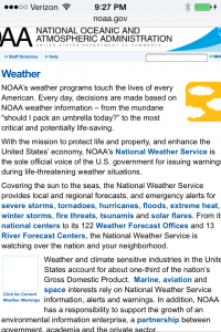 The content you cannot see you might say is “off screen”. It is actually masked by the boundaries of the viewport as on the right screen shot of the NOAA website.
 In particular for smaller devices you really do not want to exceed the device width. More importantly you do not want the device web browser scaling your fine layout and design into something hard to appreciate and even to read.