By Lon Hosford
This example shows how to dynamically load HTML content from PHP into an HTML element using JQuery and AJAX.
You might want to do this when the main page content has all the needed SEO material but there is a lot of additional content such as course or code files that can be loaded on visitor demand. For example a course page or tutorial page where you have all the summary and details about the course or tutorial that would satisfy SEO. Then you can have the user load the particular items they want.
This example provides the basic elements in JQuery, HTML, AJAX and PHP for a potential architecture to do that and then build upon further.
[ad name=”Google Adsense”]
Source Files: Download
[iframe https://www.youtube.com/embed/GhDZpphiDII 640 360]
The User Interface
This example has three buttons.
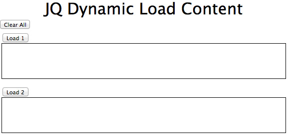
Two are for loading content and one for clearing so we can play a bit while testing. Do not expect the user will need to clear the data.


The User Interface Code
The first file to look at is the HTML document.
Full listing of ui_view_content.php
<!doctype html>
<html>
<head>
<meta charset="UTF-8">
<script src="http://code.jquery.com/jquery-1.10.1.min.js"></script>
<script src="ajax.js">
</script><link rel="stylesheet" type="text/css" href="site.css">
<title>JQ Dynamic Load Content | lonhosford.com</title>
<script>
	$(document).ready(function(e) {
        // Click handler for content_button class
		$(".content-button").click(function(e) {
            //console.log(".content-button.click");
            //console.log($(this).attr("data-content-id"));
			contentId = $(this).attr("data-content-id");
			sendServiceRequest(
				"content-id=" + contentId,
				function(data, status){
					//console.log("SUCCESS!");
					//console.log(contentId);
					//console.log(data);
					ele = "#" + contentId;
					$(ele).html(data);
				},
				function(data, status, error){
					//console.log("FAIL!");
				});
        });
		 // Click handler clear button
		$("#clear-content-button").click(function(e) {
			//console.log("#clear-content_button.click");
			$(".content").html("");
		});
   });
</script>
</head>
<body>
<div id ="wrapper">
    <header>
		<h2>JQ Dynamic Load Content</h2>
    </header>
    <div>
        <p><input id="clear-content-button" type="button" value="Clear All"></p>
        <div>
            <p><input class="content-button" type="button" data-content-id="content01" value="Load 1"></p>
			<p id="content01" class="content"></p>
		</div>
        <div>
            <p><input class="content-button" type="button" data-content-id="content02" value="Load 2"></p>
     		<p id="content02" class="content"></p>
		</div>
    </div>
</div>
</body>
</html>
Examine lines 45 and 49. You see they share the class attribute content-button.
            <p><input class="content-button" type="button" data-content-id="content01" value="Load 1"></p>
			<p id="content01" class="content"></p>
		</div>
        <div>
            <p><input class="content-button" type="button" data-content-id="content02" value="Load2"></p>
We have on line 12 the JQuery click method calling a function for the content-button class. So both buttons call this same function when clicked.
	$(document).ready(function(e) {
        // Click handler for content_button class
		$(".content-button").click(function(e) {
Lines 45 and 49 are using the element attribute data-content-id. The values of the data-content-id are content01 and content02 respectively.
            <p><input class="content-button" type="button" data-content-id="content01" value="Load 1"></p>
			<p id="content01" class="content"></p>
		</div>
        <div>
            <p><input class="content-button" type="button" data-content-id="content02" value="Load2"></p>
On line 15 we extract the data-content-id values and they are then sent on to PHP to return the needed content. All that is handled in the external ajax.js file we will look at when we get to the ajax.js code listing.
	$(document).ready(function(e) {
        // Click handler for content_button class
		$(".content-button").click(function(e) {
            //console.log(".content-button.click");
            //console.log($(this).attr("data-content-id"));
			contentId = $(this).attr("data-content-id");
			sendServiceRequest(
				"content-id=" + contentId,
				function(data, status){
					//console.log("SUCCESS!");
					//console.log(contentId);
					//console.log(data);
					ele = "#" + contentId;
					$(ele).html(data);
				},
				function(data, status, error){
					//console.log("FAIL!");
				});
        });
The ajax.js has a sendServiceRequest function which accepts a NVP (Name Value Pair). The server is expecting the name to be content-id.
Its second argument is the call back function for successful network send and receive. The third argument is if something horribly goes wrong on the network or the server and it is either not reached, never responds or it returns unexpected data formats. The data format returned is simple text containing HTML markup.
In the success function starting on line 18 we take the contentId variable that is available via closure and prepend the hash character on line 22 to create an id for JQuery to find. We thus get the same values for the two button data-content-id attributes which will be content01 and content02. On line 23 we call the JQuery html function to replace the content of the element having that id.
Lines 46 and 50 have the two possible elements with the ids of content01 and content02.
            <p><input class="content-button" type="button" data-content-id="content01" value="Load 1"></p>
			<p id="content01" class="content"></p>
		</div>
        <div>
            <p><input class="content-button" type="button" data-content-id="content02" value="Load 2"></p>
     		<p id="content02" class="content"></p>
So they are updated in line the Javascript on line 18.
Then so we can play a bit a clear button was added on line 43.
<p><input id="clear-content-button" type="button" value="Clear All"></p>
And the click handler is on line 30. On line 32 all elements with the class attribute value of content have their HTML removed.
		 // Click handler clear button
		$("#clear-content-button").click(function(e) {
			console.log("#clear-content_button.click");
			$(".content").html("");
		});
And the two elements are the same we are loading from the server seen here on lines 46 and 50.
        <div>
            <p><input class="content-button" type="button" data-content-id="content01" value="Load 1"></p>
			<p id="content01" class="content"></p>
		</div>
        <div>
            <p><input class="content-button" type="button" data-content-id="content02" value="Load 2"></p>
     		<p id="content02" class="content"></p>
		</div>
The article is not about styling so you see it is simple and designed to fit this blog width.
These are the CSS files if you need to explore. The site.css file has the style selectors particular to the web page. We first import the Meyer reset.css to create the basic uniform styling to build up.
You could get more elegant with JQuery how the content opens with saw a collapsible approach making the buttons full width and having them slide the content down once it is loaded.
site.css
/* Meyer CSS Reset */
@import 'reset.css';
body{
	font-family:"Lucida Grande", "Lucida Sans Unicode", "Lucida Sans", "DejaVu Sans", Verdana, sans-serif
	}
div{
	padding: 5px;
}
header > h2 {
	font-size:2em;
	text-align:center;}
/* Content container */
#wrapper{
	margin:0 auto;
	width:590px;
}
/* Content containers */
.content{
	border:solid 1px; #000000;
	height:70px;
	margin-bottom:5px;
	min-height:25px;
	overflow:auto;
	padding:7px;
}
reset.css
/* http://meyerweb.com/eric/tools/css/reset/
   v2.0 | 20110126
   License: none (public domain)
*/

html, body, div, span, applet, object, iframe,
h1, h2, h3, h4, h5, h6, p, blockquote, pre,
a, abbr, acronym, address, big, cite, code,
del, dfn, em, img, ins, kbd, q, s, samp,
small, strike, strong, sub, sup, tt, var,
b, u, i, center,
dl, dt, dd, ol, ul, li,
fieldset, form, label, legend,
table, caption, tbody, tfoot, thead, tr, th, td,
article, aside, canvas, details, embed,
figure, figcaption, footer, header, hgroup,
menu, nav, output, ruby, section, summary,
time, mark, audio, video {
	margin: 0;
	padding: 0;
	border: 0;
	font-size: 100%;
	font: inherit;
	vertical-align: baseline;
}
/* HTML5 display-role reset for older browsers */
article, aside, details, figcaption, figure,
footer, header, hgroup, menu, nav, section {
	display: block;
}
body {
	line-height: 1;
}
ol, ul {
	list-style: none;
}
blockquote, q {
	quotes: none;
}
blockquote:before, blockquote:after,
q:before, q:after {
	content: '';
	content: none;
}
table {
	border-collapse: collapse;
	border-spacing: 0;
}
[ad name=”Google Adsense”]
Client Side Network Handling
Nothing particularly special about using the JQuery ajax method. It is just modified to sent a NVP, receive HTML and call a success or fail function.
The ajax.js file has the sendServiceRequest generic function makes on lines 5 to 10 an ajax call to the get_content.php script. It passes in its nvpSendData parameter to the get_content.php script using POST and expects and HTML return.
Lines 11 to 16 have the successful network handler which simply called the passed in function reference.
Same for the network failure on lines 17 to 22.
ajax.js
// Generic AJAX call to POST NVP formatted data to server PHP and receive HTML
function sendServiceRequest(nvpSendData, successCallback, failCallBack){
	//console.log("sendServiceRequest");
	//console.log(JSON.stringify(nvpSendData));
	$.ajax({
		type: "POST",
		url: "get_content.php",
		data : nvpSendData,
		dataType : 'html'
	})
	.success(function(data, status){
		//console.log(".done");
		//console.log("success data: " + JSON.stringify(data));
		//console.log("Return AJAX status: " + status);
		successCallback(data, status);
	})
	.fail(function(data, status, error) {
		//console.log(".fail");
		//console.log("Return data: " + JSON.stringify(data));
		//console.log("Return AJAX status: " + status);
		failCallBack(data, status, error);
	});
}
Server Side Network Response
The first file is a stripped down controller for PHP that only returns HTML. You see the headers on lines 10 through 13 which are depending on how you want caching handled.
Line 17 sanitizes the POST content-id value we are receiving and places it into the $content_id variable. If the sanitzing fails then $content_id is false and we are returning a paragraph with a hard space on line 23. This is all we need for the demo. We could also return nothing.
If the $content_id variable is a string then we include the content.inc.php file.
get_content.php
<?php
/**
* Process network data received and return html content matching content-id.
* @author Lon Hosford
* @link www.lonhosford.com
*/
/**
* Standard headers to avoid caching
*/
header('Cache-Control: no-cache, must-revalidate');
header('Expires: Mon, 26 Jul 1997 05:00:00 GMT');
header('Pragma: no-cache'); // HTTP 1.0.
header('Expires: 0'); // Proxies.
/**
* Validate and capture content-id
*/
$content_id = filter_var($_POST['content-id'], FILTER_SANITIZE_STRING);
/**
* Return content based on content-id
*/
// Invalid content-id format received
if ($content_id == false){
echo '<p> </p>';
// Valid content-id format received
}else{
include_once "content.inc.php";
}
?>
The content.inc.php file is designed to return to standard out. It uses a switch statement to choose the $content_id variable on l one 7 which has the value passed in from the client. Lines 8 and and 11 have the corresponding content to return. Line 13 handles an invalid $content_id value.
There are many ways to return HTML from the server with PHP including storing it in a database. So you can do as you wish and even use another data format such as JSON or XML for the standard in and standard out.
content.inc.php
<?php
/**
* Std-out html content matching content-id from client.
* @author Lon Hosford
* @link www.lonhosford.com
*/
switch ($content_id){?>
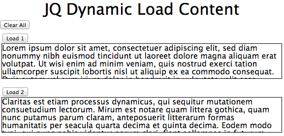
<?php case 'content01':?>
<p>Lorem ipsum dolor sit amet, consectetuer adipiscing elit, sed diam nonummy nibh euismod tincidunt ut <strong>laoreet dolore magna aliquam</strong> erat volutpat. Ut wisi enim ad minim veniam, quis nostrud exerci tation ullamcorper suscipit lobortis nisl ut aliquip ex ea commodo consequat. Duis autem vel eum iriure dolor in hendrerit in vulputate velit esse molestie consequat, vel illum dolore eu feugiat nulla facilisis at vero eros et accumsan et iusto odio dignissim qui blandit praesent luptatum zzril delenit augue duis dolore te feugait nulla facilisi. Nam liber tempor cum soluta nobis eleifend option congue nihil imperdiet doming id quod mazim placerat facer possim assum. </p>
<?php break;case 'content02':?>
<p>Claritas est etiam processus dynamicus, qui sequitur mutationem consuetudium lectorum. Mirum est notare quam littera gothica, quam nunc putamus parum claram, anteposuerit litterarum formas humanitatis per seacula quarta decima et quinta decima. Eodem modo typi, qui nunc nobis videntur parum clari, fiant sollemnes in futurum.</p>
<?php break;default:?>
<p> </p>
<?php break;
}?>
[ad name=”Google Adsense”]


 In particular for smaller devices you really do not want to exceed the device width. More importantly you do not want the device web browser scaling your fine layout and design into something hard to appreciate and even to read.